Custom Acrylic Engraving Guide for Displays

A clear acrylic block can make a product, award, or collectible appear to float. Add engraving, and that same piece becomes a branded presentation tool with permanent detail that does not compete with the object on display. This custom acrylic engraving guide explains how to plan an engraved acrylic piece that looks precise, reads clearly, and supports the purpose of the display.
Start With the Job the Engraving Must Do
Engraving is not only decoration. On a retail riser, it may identify a product collection or reinforce a brand at the point of sale. On an award, it carries the recipient name, achievement, and date. For a gallery or collector display, it may provide discreet provenance or a title without adding a separate placard.
Define the primary function before choosing a block, base, or panel. A logo that must be recognized from several feet away needs different scale and placement than fine text intended to be read at close range. A corporate recognition piece may need room for multiple lines of copy, while an art display often benefits from a smaller engraved mark placed away from the viewing area.
The most effective designs give the engraved message enough visual authority without taking attention away from the displayed item. Acrylic is valued for clarity. The engraving should work with that clarity, not overwhelm it.
Choose the Right Acrylic Format First
Engraving is only one part of the finished presentation. The shape, thickness, and footprint of the acrylic determine how the piece performs in a real environment.
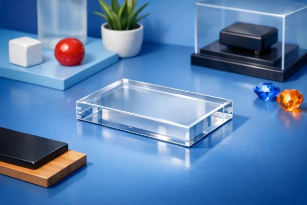
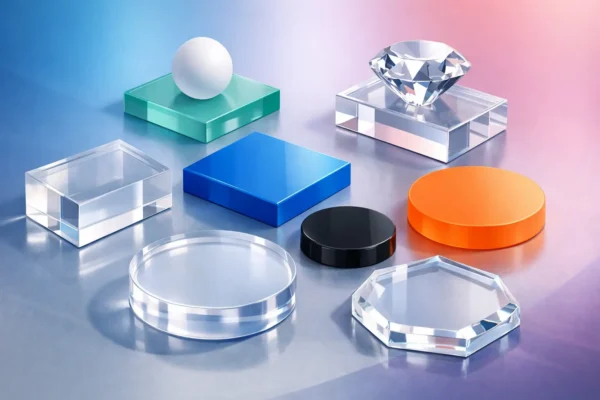
A solid acrylic block provides substantial weight and a premium, architectural look. It is a strong choice for awards, recognition pieces, branded desk displays, and high-value collectibles. Acrylic cubes create a compact format for logos, small graphics, or commemorative messages. Rectangular bases and risers work well when the engraving supports merchandise, sculpture, or product displays.
Consider viewing angle as carefully as size. A front-facing engraved panel should be readable at eye level. A logo engraved on the top surface of a base is best suited to viewers looking down at the display. If an object will sit directly on the acrylic, leave sufficient unengraved area for stable placement and a clean visual field.
Thickness matters, too. Thicker solid acrylic creates more visual depth and can make a reverse-engraved design appear suspended within the material. Thinner panels are often appropriate for signs and identification plates, but they have less visual mass and may require a different mounting or display approach.
Custom Acrylic Engraving Guide: Plan the Artwork
Clean source artwork is the foundation of clean engraving. Vector files are generally the preferred format for logos, line art, borders, and type because the paths can be scaled without becoming soft or distorted. Raster artwork can work for certain images, but low-resolution files often produce rough edges or inconsistent detail.
Before submitting artwork, review the logo or graphic at the intended physical size. Fine lines that look sharp on a computer screen may be too narrow to reproduce clearly on a small acrylic surface. Likewise, crowded copy may become difficult to read once engraved.
For the best results, simplify where needed. Remove unnecessary micro-details, increase spacing between small elements, and avoid extremely thin strokes. A one-color logo with confident line weight often produces a stronger engraved result than a complex graphic compressed into a limited area.
Select Fonts for Real-World Readability
Typography should be chosen for the finished piece, not just the brand style guide. Clear sans serif and well-defined serif fonts typically engrave well when sized appropriately. Script fonts can look refined on awards or gifts, but thin connecting strokes and tight letterforms may lose definition at smaller sizes.
Avoid placing several decorative fonts on the same item. A recipient name in a more expressive typeface paired with concise supporting information in a straightforward font is usually sufficient. Keep line lengths manageable, especially on narrow bases or cubes.
Check spelling, dates, capitalization, and recipient names before production. Engraving is permanent, so final proofing is part of the fabrication process, not an afterthought.
Use Contrast Strategically
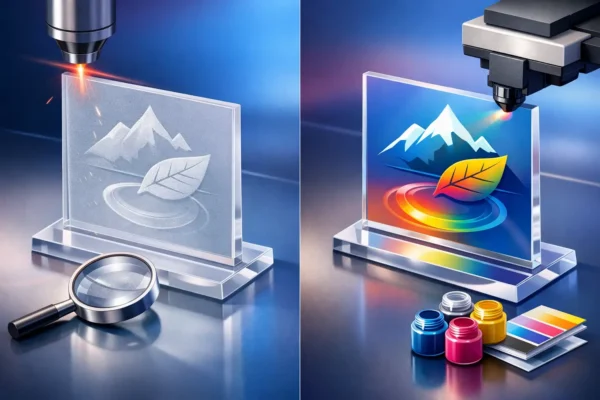
Laser engraving typically creates a frosted mark against clear acrylic. This understated effect is elegant, but its visibility changes with lighting, background color, and viewing angle. An engraved design may appear more pronounced against a dark backdrop and more subtle when surrounded by bright, reflective surfaces.
If the message must stand out in a busy retail environment, consider increasing the graphic scale, using bolder type, or positioning the engraved area where a darker background will naturally sit behind it. For presentation pieces where a refined appearance is the goal, subtle frosted engraving may be exactly right.
Decide Between Front and Reverse Engraving
Front engraving places the design on the viewing surface. It provides a direct, tactile finish and is often suitable for labels, signs, award faces, and applications where the engraved surface will remain protected from heavy handling.
Reverse engraving places the design on the back of a clear acrylic piece so it is viewed through the polished front face. This approach can create a cleaner, deeper appearance and helps protect the engraved area from routine contact. It is particularly effective for desk blocks, premium signage, and display pieces intended to be seen from the front.
The choice depends on the application. Reverse engraving can add dimension, but it requires mirrored artwork and careful planning for the final viewing direction. Front engraving is more straightforward and may be preferred when the piece will be viewed from multiple sides or when the design needs to align closely with a displayed object.
Set Practical Margins and Placement
Engraving placed too close to an edge can look crowded and may feel visually unbalanced. Leave a comfortable margin around logos, text, and borders. The appropriate amount depends on the overall size of the piece, but the design should appear intentionally centered or intentionally aligned, never accidentally squeezed into the available space.
For a rectangular base supporting a product, a logo may work best near the front edge, where it remains visible without interfering with the display. For an award block, centered artwork often feels formal and balanced. For retail fixtures, consistent placement across multiple pieces creates a more organized merchandising system.
Also consider what will cover the acrylic. If a sculpture, product package, or collectible overlaps the engraved area, the message may disappear from normal viewing angles. Provide a diagram or clearly describe the intended object placement when the relationship between the engraving and the display is critical.
Account for Lighting, Handling, and Environment
Acrylic displays perform best when they are specified for their setting. Bright spotlights can make engraved details glow, while diffuse lighting produces a quieter, more restrained look. In a trade show booth, retail store, or event venue, test the concept against the lighting conditions if the engraving carries essential information.
Handling is another practical consideration. Clear acrylic shows fingerprints more readily than opaque materials, particularly on large polished surfaces. Reverse engraving can help keep the detailed face protected, while proper cleaning preserves the appearance of both the acrylic and the engraved mark. Use a soft, non-abrasive cloth and cleaning products appropriate for acrylic. Avoid abrasive pads and harsh solvents that can haze or damage the surface.
For displays that will be moved frequently, select a format with enough thickness and footprint to remain stable. For permanent installations, consider whether the engraved area needs to accommodate mounting hardware, adhesive zones, or other functional details.
Review the Proof as a Finished Object
A digital proof confirms more than spelling. It should show the acrylic dimensions, engraving position, orientation, line breaks, and the relationship between the design and any displayed item. Ask whether the piece will still read correctly from the expected distance and whether the design remains balanced when viewed in its actual orientation.
At Acrylic Bases and Blocks, precision-fabricated solid acrylic formats provide a polished starting point for custom engraved displays, awards, and branded presentation pieces. The strongest results come from matching the artwork to the scale and purpose of the acrylic, rather than treating engraving as a final add-on.
A well-planned engraved acrylic piece earns attention quietly. Specify the right format, simplify the artwork, protect the reading area, and let crystal-clear material give the message the professional presence it deserves.